The famous statistician, Hans Rosling, used to say the aim is to go from numbers to information to understanding. This is the essence of how data should be used, shared and presented.
Data can be presented in many different ways but maps are perhaps the best way of visualizing spatial information. As technology has progressed since the early Turin Papyrus Map produced by the ancient Egyptians in 1160 BCE, humans have been developing and refining how we model our environment to improve our understanding of complex information.
Digital maps now help navigate us through complexities of the modern world with ease. But how can this same technology be used to support development communication practitioners in the field?
Using story maps – CABI’s experience in Tanzania and Ghana
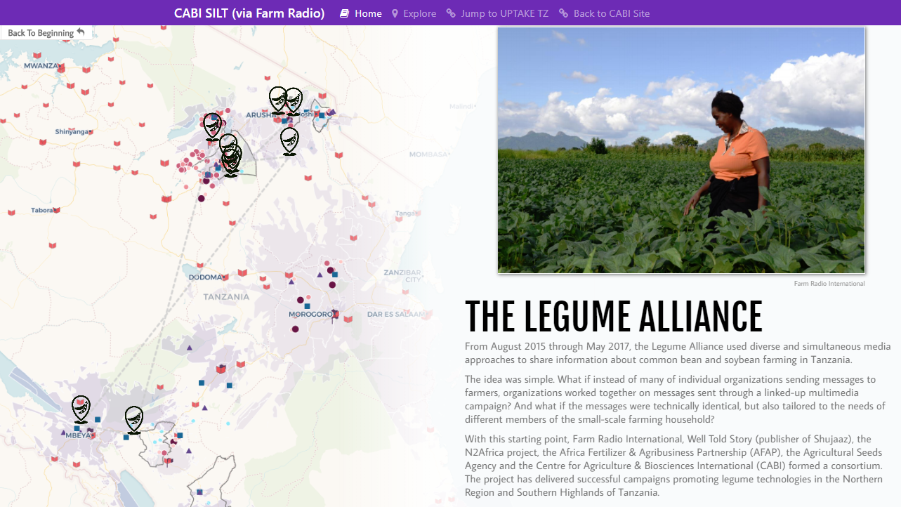
Between 2015 and 2018 Scaling Improved Legumes Technologies (SILT) used innovative multimedia campaigns to scale-up improved soybean and common bean technologies and establish sustainable input systems. These included participatory radio listening groups, two models of demonstration plots, and the use of comics, posters and leaflets.
To understand the reach of this campaign-based approach, CABI and Farm Radio decided to produce a story map for the SILT project to visualize the impact data.
Story maps are a form of data visualization and a valuable resource for recording the complex relationships projects have with different communities to show how multiple campaign elements have been built up in different locations. So, for example, this enabled the team to show the impact of the radio, indicating the number of listeners, where they lived and how they’ve used the information on their farms.
A combination of interactive maps and descriptive stories allow the viewer to move through project milestones and easily explore the geographical spread and demographic impact of a project.
The maps have helped clarify the relationships between the different elements of the campaign. Geocoding of community locations, languages spoken and attendance figures gives data new meaning and helps lay out “cause and effect” milestones over the entire project cycle.
Mark Leclair, from the communications and knowledge management team at Farm Radio, thinks that the cool thing about these maps is that they build up pages of narrative that tell the story of the campaign. He also notes that the maps have a level of interactivity that allows people to drill down to the areas of information that interests them.
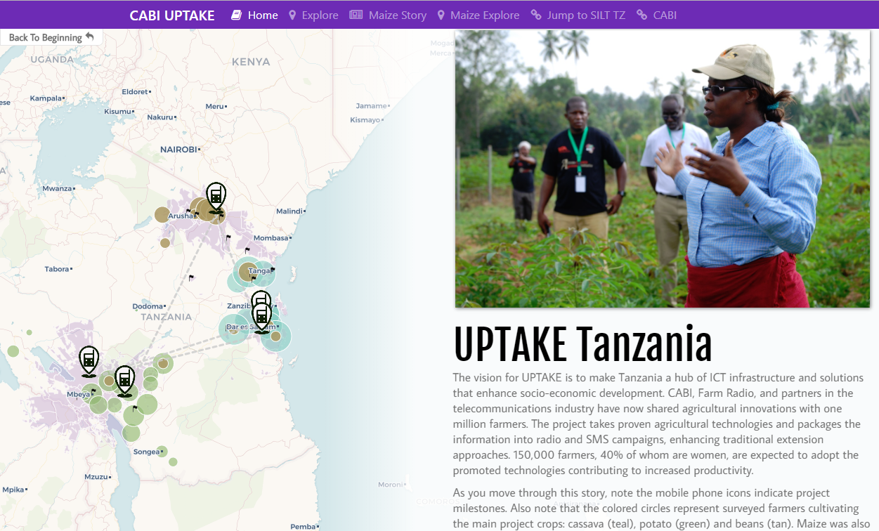
Inspired by the SILT story map, CABI has made similar maps for other development communication campaigns developed by ASHC. This has included a second campaign in Tanzania also developed with Farm Radio, known as Upscaling Technologies in Agriculture through Knowledge and Extension (UPTAKE).
Stephanie Gakuo, a development communications specialist at CABI, explains that the UPTAKE project was exploring how digital media, especially radio and SMS, worked together to share agronomic information with farmers on a variety of crops, including potatoes, maize, beans and cassava. She felt that at a glance, the maps tell the UPTAKE story of how the campaigns built up, whom we reached and where. This means that stakeholders can straight away cut to the project’s focal areas, view the story and tell where the project had greatest effect.
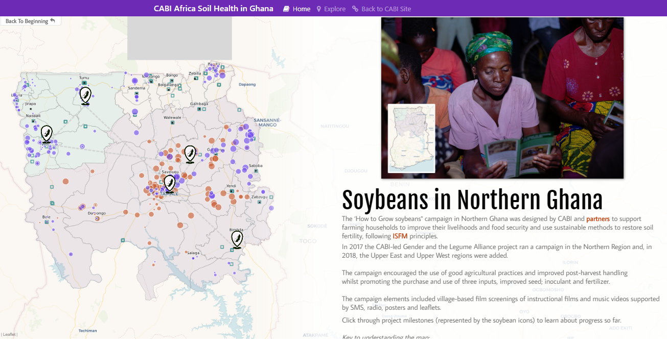
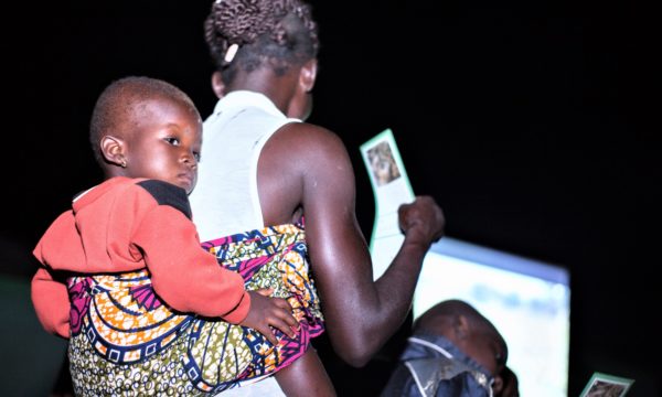
CABI has also produced maps for the soybean cultivation campaigns in Northern Ghana under the Gender and Legume Alliance (GALA) project. Over two years some 300 village-based film screening have been shown to around 70,553 members of farming households with information on soybean farming and in 2018 fall armyworm was added to the film screenings.
James Watiti, Coordinator – development, communication and extension at CABI, reflected that in Ghana, CABI is building up a lot of data about the village-based film screenings and other key data like the location of agro-dealerships. He feels that holding this data as maps will make it easy for CABI, and others, to think about the next steps in the soybean campaign as we explore options with different partners and provide better information services to farmers.
Mapping the future of development communications
All the story maps mentioned here are available (see links below) for anyone to better understand how mapping could help to provide better information services to farmers.
Trends in data-driven adaptive project management being adopted by the likes of UNDP and USAID demonstrate the value of data, not only for monitoring development projects but also directly driving how they are designed and delivered throughout a projects life cycle.
It occurs to me that because story mapping presents impact in such a compelling visual and detailed way, donors may start to require the use of them when engaging with multi-stakeholder multimedia development communications projects. They are certainly part of the way that development communication is contributing to Rosling’s desire to go from numbers to information to understanding.
Related News & Blogs
Social norms: why women farmers might not be getting ahead despite development support
Project team members visiting farming community in Muzaffargarh, Pakistan to know the knowledge and skills of vegetable farmers (Credit: CABI). On International Women’s Day, Bethel Terefe, Gender Coordinator, CABI takes a look at gender-related social…
8 March 2021


